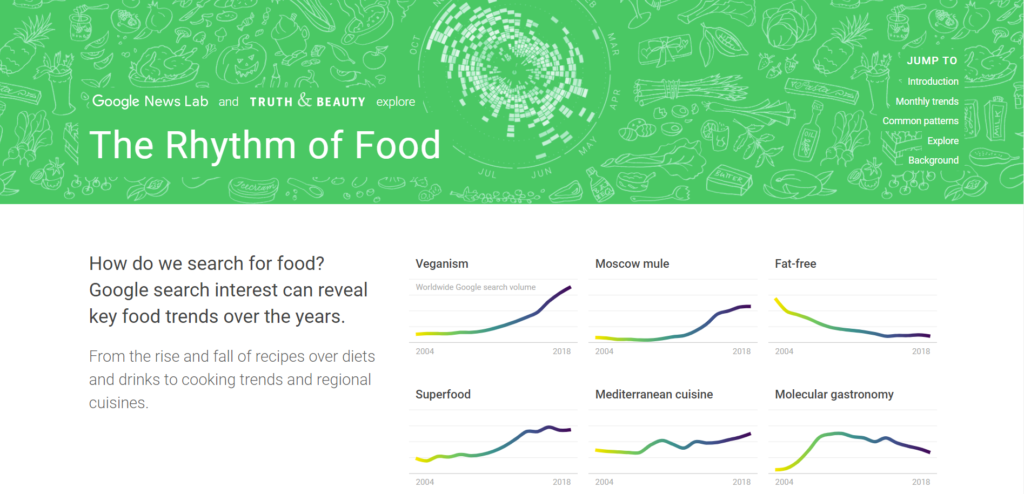
Out of all the names of the projects we could reverse engineer, the Rhythm of Food sounded the grooviest and the tastiest. The Rhythm of Food is presented as a webpage with multiple graphs showing the frequency of Google searches for certain keywords related to food and food culture. It seems at first as if the goal of the project is to display consumption trends and interest in certain types of foods, but it isn’t obvious who the target audience is. While the graphs are beautiful and easy to understand, one would imagine data like this would be useful to researchers and companies instead of the layperson.
This project is a collaboration between Moritz Stefaner, the operator of Truth and Beauty, and Google News Lab, a team within the Google News Initiative that collaborates with journalists and entrepreneurs to drive innovation in news.
To make graphs such as these, they analyzed the names of ingredients, recipes, and other food related search terms, drawing from databases such as FooDB. Search data for these terms were collected from Google Trends, a Google website that analyzes the popularity of queries on the Google Search engine. Focusing on the US, more than 12 years of weekly Google Trends was used while Google Knowledge Graph was utilized to differentiate search terms.
After investigating international and regional differences in food queries and specific diets and recommendations, they settled on seasonality of food as the focal point for their project, with year-over-year trends as a secondary focus.
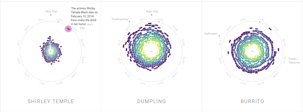
The components of this website were designed with a martini glass structure in mind, starting with a wide exploration and introduction to the project. This is where food rhythms are defined as the trends in searches for food on Google. After this, it narrows down to a narrative path through season, month, and countries and regions to walk the audience through different ways you can view the data. These radial year-clock charts can be interacted with, as the audience can select tabs to view different data visualizations. Annotations are sprinkled among these charts to provide interesting insights to trends and irregularities, such as the Shirley Temple drink experiencing a one month spike in 2014 as people made drinks in honor of the actresses’ death. Towards the bottom of the page, the audience has more agency and they can search for food terms and filters. At the very end the background for the project is explained. This being a single page website allows a story to be told.
This project was built using ES2015, webpack, react, Material UI, and d3 v4. These are mostly programs working on JavaScript to display data and create websites. Other collaborators on this project are Yuri Vishnevsky and Dominikus Baur who are data visualization experts, as well as Stefanie Weigele for the illustrations, and Destry Sibley for text and annotation. Collaborators from the Google News Lab include Simon Rogers and Alberto Cairo.