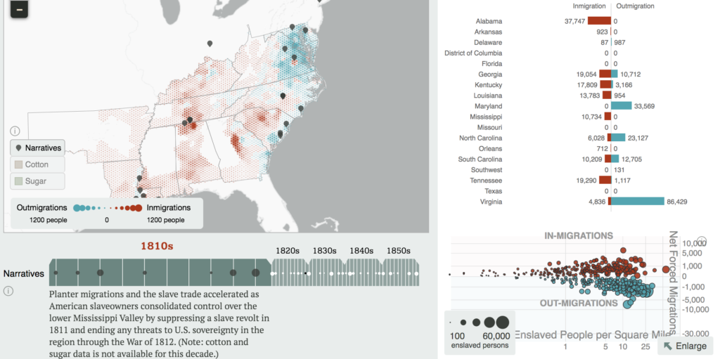
The project The Forced Migration of Enslaved People by Robert K. Nelson, Edward L. Ayers, Justin Madron, and Nathaniel Ayers provides a visual representation of the forced migration of enslaved people in the United States from 1810-1860. The project includes a map itself of most of the East Coast, some Southern States and the District of Columbia that uses various- sized blue dots to represent the forced outmigration of enslaved people and various-sized red dots to represent the forced immigration of enslaved people for each decade (as shown below).

The authors also provide historical context that explains why the forced immigration patterns existed for each decade and uses graphs and tables to compare the forced immigration and outmigration patterns for each state. My favorite part of the project is that the creators also included personal narratives of enslaved people, that can be accessed for each decade alongside the map. Forced Migration does a really good job showing the forced migrations of enslaved people in a visual, easily-accessible way and showing the data in many different forms.
In terms of sources, this project used the Census data from the time, which allowed the creators to obtain a reasonable estimate of the population of enslaved people per state. The Census data also allowed the makers of this project to calculate the growth rate, which was helpful in determining overall immigration and outmigration rates. They used the Atlas of Historical County Boundaries from Newberry Library to determine the exact location of state boundaries.
In order to process this data, the project authors used Frederick Bancroft’s formula estimate of in-migrations and out-migrations per state (because much of the data of birthplace and location was not recorded). They applied this to the Census data, and then used the GIS program (a mapping software) to assign each state they worked with a population of enslaved people based on its size/area and create their digital map. It doesn’t say explicitly on the website what programs were used to make the graphs, etc.
This project is presented on an interactive website. All elements of this project (the map, the graphs, historical information, etc.) are presented on the same screen. Users interact with the project by zooming in and out of the map, selecting different years to see the changes in forced migration patterns and choosing different personal stories to read.
Forced migration is definitely in conversation with the history field. It uses so much historical data and providing visual imagery and tools to understand such an important and horrifying historical event. This project turns the events of an historical period into something visual. By including narratives of enslaved people, Forced Migration also is in conversation with the english and anthropology fields in a very accessible way. This project is easy to use and presents information in language that most people can understand. Forced Migration is simple and accessible, which is why I think it was intended for the general public instead of just academic specialists.
Great blog post Kaylin! The map seems really easy to read and I appreciate that the project creators chose stark colors blue and red to differentiate between outmigration and immigration.