
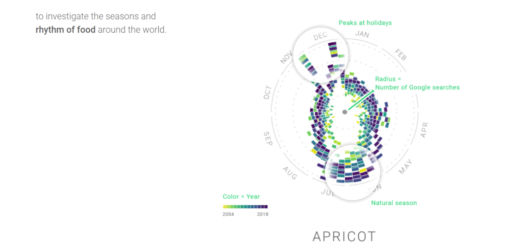
The Rhythm of Food, an online collaboration between Google News Labs and Truth & Beauty, is an incredibly aesthetically pleasing and interactive project that illustrates the Google Search trends for various foods in the United States in the last 15 years. It uses thousands of data points to represent the number of searches for a certain food in each month of a particular year, allowing the user to visualize recent trends in month-by-month and year-by-year searches for many foods, drinks, and cuisine-related terms.
The primary source for this project was food-related search terms such as recipes, ingredients, and food items and the frequency with which these terms were searched on the Google search engine. Further, all of the search data was recorded along with the year and time of the month the search was made.
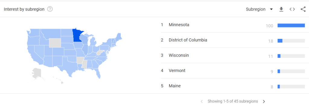
These search data were processed using Google’s own Google Trends, which gives geographical and temporal data for any searchable term. Results for a search will display interest over time, interest by region/subregion, related topics and related searches.
Further, this project used topics covered by the Google Knowledge Graph, which is a knowledge base used by Google to enhance search results. If you have ever searched for a term and seen a panel of information, often accompanied by images, appear on the right-hand side of your computer browser, or the top of your mobile device, that’s the Google Knowledge Graph. This database pulls from primarily from the CIA World Factbook, Wikidata, and Wikipedia, according to Google.
Using these programs and technologies, The Rhythm of Food calculated the number of searches for a particular term or set of related terms each week over a period of 15 years. Once this data had been processed and collected, data points reflecting the time (week of the month and year) and frequency (number of searches in that week) were plotted on a year clock graph. Each clock graph is interactive, so the user can hover over each point to see the specific Google Trends score and week of that point. Further, points from different years are colored differently so the user can visually discern not only differences in search frequency by week over the course of a year, but also over the course of 15 years.
The goal of this project was to reveal trends in the food terms we search for over time. By collecting, analyzing, and visually displaying this data, it becomes easy to see that, for example, certain times of the year correspond to more searches for certain items, and that certain foods have gained and lost popularity in the last decade and a half.
It is interesting to consider the audience of this data visualization project. While it is perhaps marketed towards average consumers and those who may simply be curious to know if their favorite holiday dish is indeed the favorite of many others around that time of year, data like this could be very effectively used by retailers to know when to push specific food items. It’s no wonder we hear all about pumpkin spice lattes in the early fall before it mysteriously disappears until the next year – both consumers and Starbucks know when to buy and sell them, thanks to data like this.
Hi Henrie, thanks for the Google Trends example! I liked how you explained, and not just mentioned, the tools that The Rhythm of Food researchers used.
This was so interesting, discussing who the target audience for such a project is would be worthwhile because while such infographic heavy content might not appeal to the general public, the topic discussed seems engaging and fun enough to grab anybody’s attention.
Henrie, I really enjoyed reading your post! In particular, I found myself similarly curious about who the target audience could be for such a project. I certainly agree that this project has tremendous marketing potential, and I wonder as well if this has visualization project has potential in the sociological/historical field as a way of studying populations by the foods they consume? From both a cultural and a nutritional perspective, I’m really interested to see what questions/answers one could arise from this line of research.