Link: http://www.sixdegreesoffrancisbacon.com/?ids=10000473&min_confidence=60&type=network
There’s a game called “Six Degrees of Kevin Bacon”, where a person attempts to figure out how many degrees of separation there are between the actor Kevin Bacon and any particular movie, actor, or director. While Sir Francis Bacon isn’t a famous actor – he just developed a little thing called the scientific method – the same premise applies: how many degrees of separation are there between other famous intellectuals and Francis Bacon? This is the goal of the project: to map out the social networking of early modern scientists and intellectuals via their connection to Francis Bacon.
Of course, once you’ve mapped out the social network of one person, you also have a good degree of connections between other people in that network; although it starts with (and is named after) Francis Bacon, the project allows you to input a name of someone in the network, and see their personal social map.
So, let’s break this down. First, in order to make something like this, you’re going to need a good deal of historical information. A list of every major historical figure Bacon directly communicated with would be step 1, and their social links next. That data acts as our source, and as I’m not a historian I don’t think I can go into much more detail about how that is obtained.
Second, the creators need to decide what the project will do. First and foremost, it maps the personal connections between historical figures. However, the project also allows the user to type in a name and generate that person’s social map, meaning we can’t just create a static image of Bacon’s friends. In addition, we want to be able to sort by different kinds of people, like mathematicians or diplomats. That final bit will require a bit more info from the historians, but it shouldn’t be that much more work.
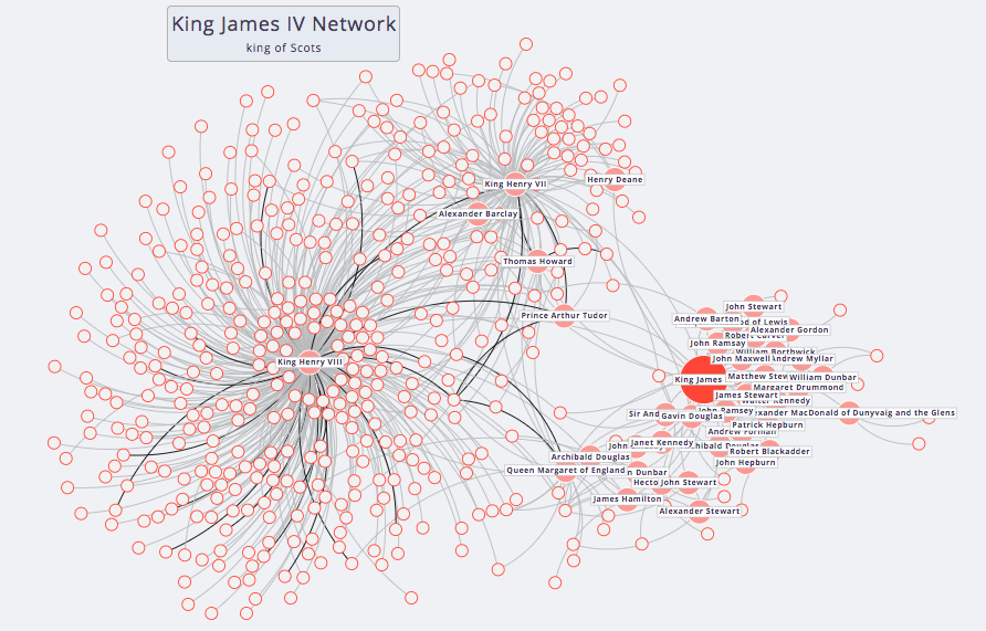
Now, how do we visualize these things? The project could have chosen to present a list of names, sorted by distance of connection. However, they instead chose a bubble chart (I don’t know if it has another name) that not only represents the level of connection in an easy to understand visual shorthand, it also has visual connections between the different people allowing users to see through whom a second-degree connection is made.
The code is available on the team’s github page, located here: https://github.com/sdfb/sdfb