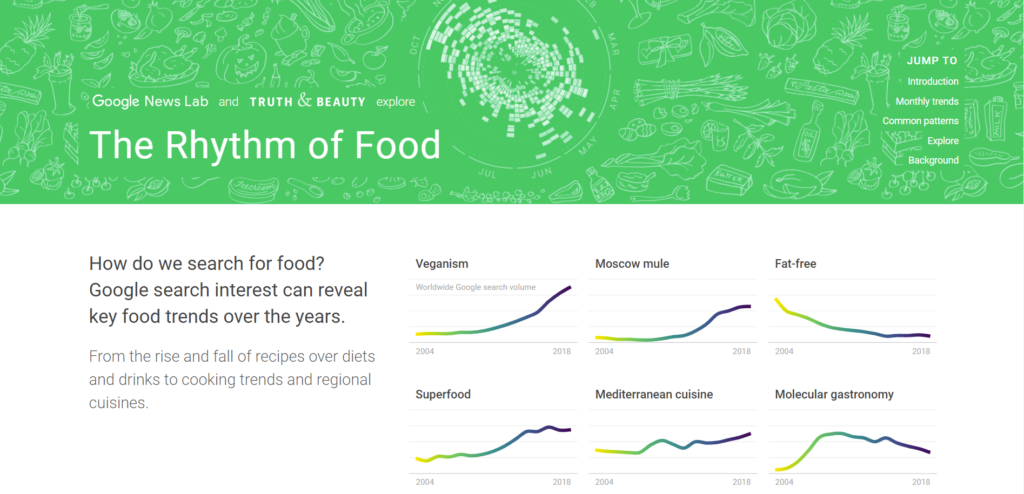
Feeling a bit peckish, I decided to analyze The Rhythm of Food, a data analysis collaboration from Google News Lab and Truth & Beauty. This nifty data visualization shows the popularity of certain gastronomical search terms over time through colorful, eye-catching graphs and animations. The information is compelling and accessible. I think plenty of people would find this information fascinating, to see how eating habits have changed over the years or within a year.
In order to make these graphs, the creators found their search terms from databases like https://foodb.ca/foods. Then they used Google search data from Google Trends, and focused on data from the United States. They used Google Knowledge Graphs to distinguish search terms, e.g. to distinguish Apple computers from the fruit.
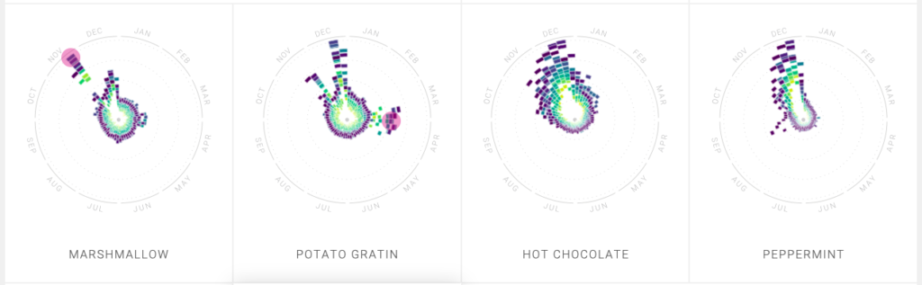
The project analyzed regional and international difference in searches, the seasonal fluctuations in searches, and the change over years in frequency of certain searches. The website holds the viewers attention with its compelling narrative flow, and the different ways it presents data. Some terms have captions providing more insight into the data, and providing interesting bits of additional information. For example, kale’s popularity in Germany is explained by the site as being a native plant. The user can interact with the data, clicking on it to see more. This website accomplishes what the digital humanities should–it displays humanistic research (food being an element of culture) in an accessible and interesting way.
This project was built with programs mostly using JavaScript to display data and create the website.