I found Lin’s lecture on data visualization interesting and engaging. It was really useful to have some advice on how to approach data visualization, and it was really nice to see how graphs could tell a story and have a comparison between bad and good visualizations.
After the class, I went over to the r/dataisugly subreddit to browse, and I found many graphs that were quite honestly, hilarious and a breath of fresh air from the excellent examples that I’ve seen in class. Here are some of my favorites:
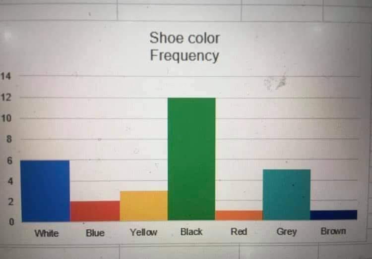
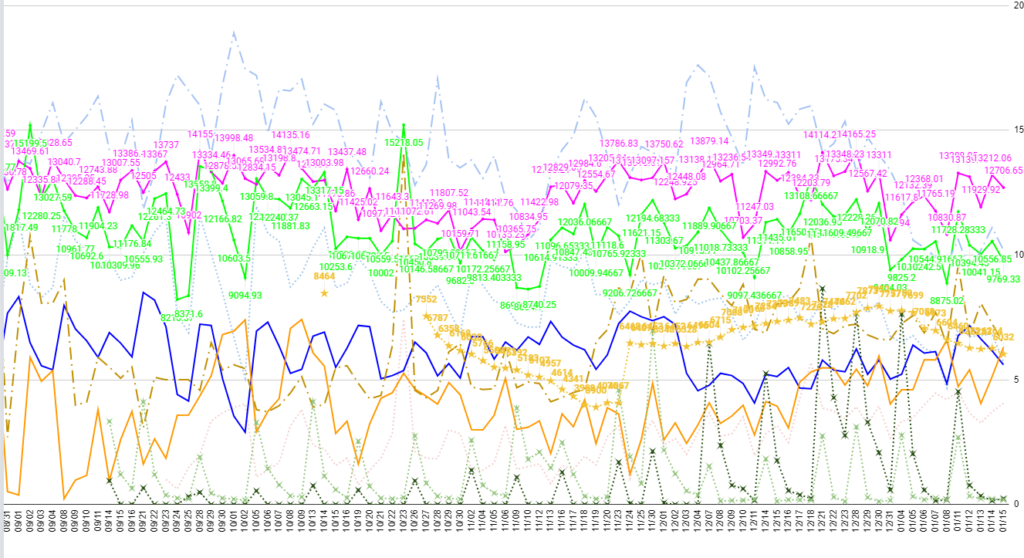
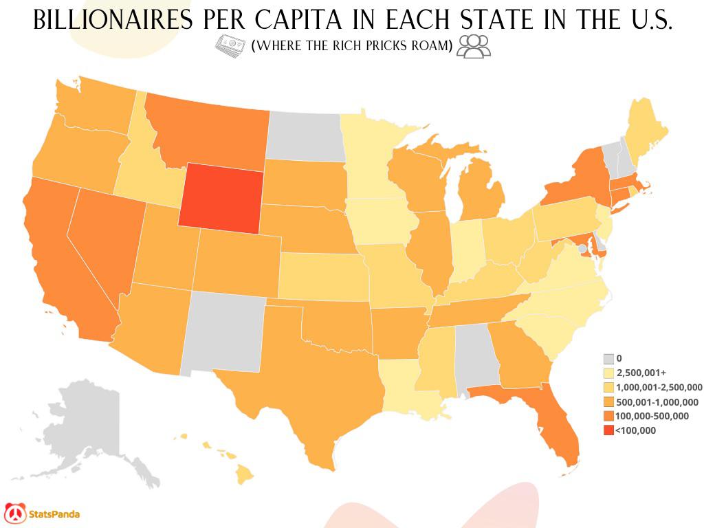
Unlike the images on the lie factor website, I can see these ones clearly. Each one is bad for a different reason. The first, has confusingly colored bars. Despite successfully not using a pie chart and not offending Lin, the graph manages to confuse its audience with its color scheme. The next one just has too many data points, and has left out the axes labels. The amount of data points is dizzying, and it is impossible to distinguish any trends. The final visualization just has a wrong label, as the legend would imply that some states had more than 2.5 million billionaires for every 1 person, and the scale doesn’t make sense with the most intense color being the second smallest bracket. These are all mistakes I’ve made myself in the past, as data visualization is hard.
I also didn’t think that changing scales midway through a graph was bad if it was clearly shown. With the variation in some datasets, changing the scale can be useful, but I would have to find some examples of how it can be done properly.
Fun post Lewis! I also found r/dataisugly hilarious, especially the billionaire per capita visualization. The shoe color histogram was also a pretty good example of bad use of colors.
Hi Lewis, I really liked this post! It really enforced for me that data visualization can be used to show data with such a wide range of importance (for example, billionares per capita and shoe sizes vs. some of the graphs we saw on Lin’s presentation in class). I found the middle graph especially horrifying.