Isao Hashimoto’s “2053” is a 14 minute time-lapse animation of every nuclear explosion that occurred between 1945-1998. It uses geographical and time data to tell its story, providing the viewer with information on the location, the month and year of which it occurred, a count of explosions per country, as well as a summary count.
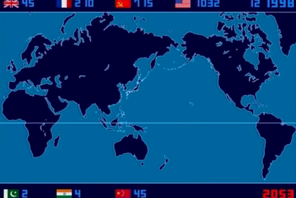
The data is presented simply–the color coded explosions correlate to each of the different countries, the numbers in the top right corner indicate the month and year, and the counter in the bottom right corner counts up all of the explosions as they occur on the screen. This simplicity is what makes the data visualization so effective. By eliminating any of the distracting labels or descriptions that often clutter data visualizations, Hashimoto is able to use the impact that comes from simplicity to tell the story of the history of nuclear explosions. This type of data seems to work particularly well with time-lapse animations because the data is so straightforward and can be understood with little to no narrative explanations.
2053 is just one example of data visualization in the new and exciting format of 4D presentation. While incorporating the 4th dimension allows for more effective sequential data presentation, there are also several drawbacks, unique to the format of animations. Lin’s discussion on Tuesday made me realize just how important every aspect of your data visualization is–one small mistake can lead to ineffective or even inaccurate interpretations of the information by your reader.
In the case of animations, one should be careful of adding too many visual elements, particularly moving elements, in order to avoid distracting the viewer away from the central and important story being told in the video. Compared to a still image of a 2D infographic, animations combine lots and lots of images. This means that there is more room to put information, running the risk of information overload.
On the other hand, trying to avoid information overload could lead you to under-explain your data. Hashimoto used data that was very straightforward so no wordy explanations were needed for the animation. However, not every dataset is that simple, and trying to replicate 2053 with a more complicated topic might leave viewers confused.
Finally, as I was thinking about the new possibilities that come with 4D data visualizations, it lead me to think about all of the different ways that animations can be used, depending on its content. For example, fMRIs, used for measuring activation in the brain, are technically 4D data visualizations just like Hashimoto’s 2053. In the case of fMRIs, the machine takes a series of pictures of someone’s brain and the images are stitched together into an animation that tracks the pattern of blood flow, therefore acting as a tool to visualize sequential data. In this way, I think that animations offer a new way to present large amounts of sequential data in an organized and straightforward manner that could not be done as neatly in 2D images alone.
I definitely agree that it would be important for 4D animation data visualizations to prevent information overload. I think keeping them relative simple (like how 2053 was made) helps provide a effective basic level introduction, while exploring the details may require some other form of data visualization techniques.