I was interested in multiple aspects of Lin’s presentation, but the one that stood out most to me is the importance of color. Like Lin said, the colors with which data are represented have a huge effect on our perception of that data. This is not only true for organization principles (e.g. using a color scheme that makes sense, making the colors visible and differentiable from one another), but also for conveying information — a red line sends a different message than a blue or green line. This might seem like common sense, but I think that it is really important to remember when creating a visual representation of data. Every color decision plays an important role in telling the viewer a story. I also really liked how Lin encouraged us to be okay with taking a lot of time to fiddle with colors; whenever I give a presentation or present data, I always feel guilty about spending so much time on style, because it feels like it is different from substance. What Lin’s presentation, and DH in general, emphasize is that style and substance are one and the same.
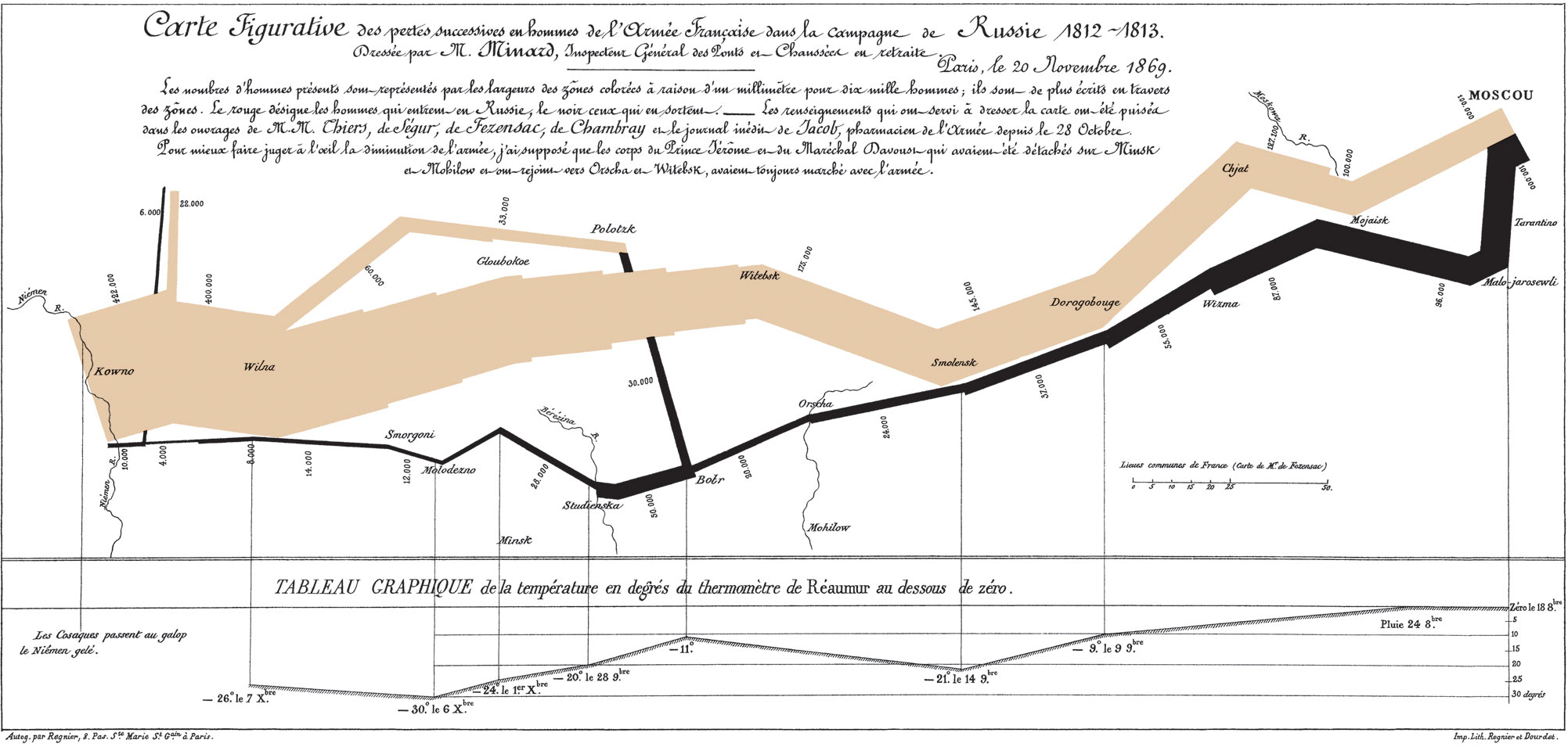
Lin’s emphasis on color made me think about the Minard map. I think that this map is so effective in part because its color scheme is so simple. The tan and black sections are very visible and easily differentiated from each other. The use of black to represent the troops’ return journey makes sense because the line gets very small and hard to see, and also because of the symbolism of black as a color associated with mourning. The colors are clear, but they are also muted — the map is not gaudy or bright, but rather lets the numbers do the talking. This fits with Minard’s broader goal of exposing the huge death toll in an accurate and easily visible way.