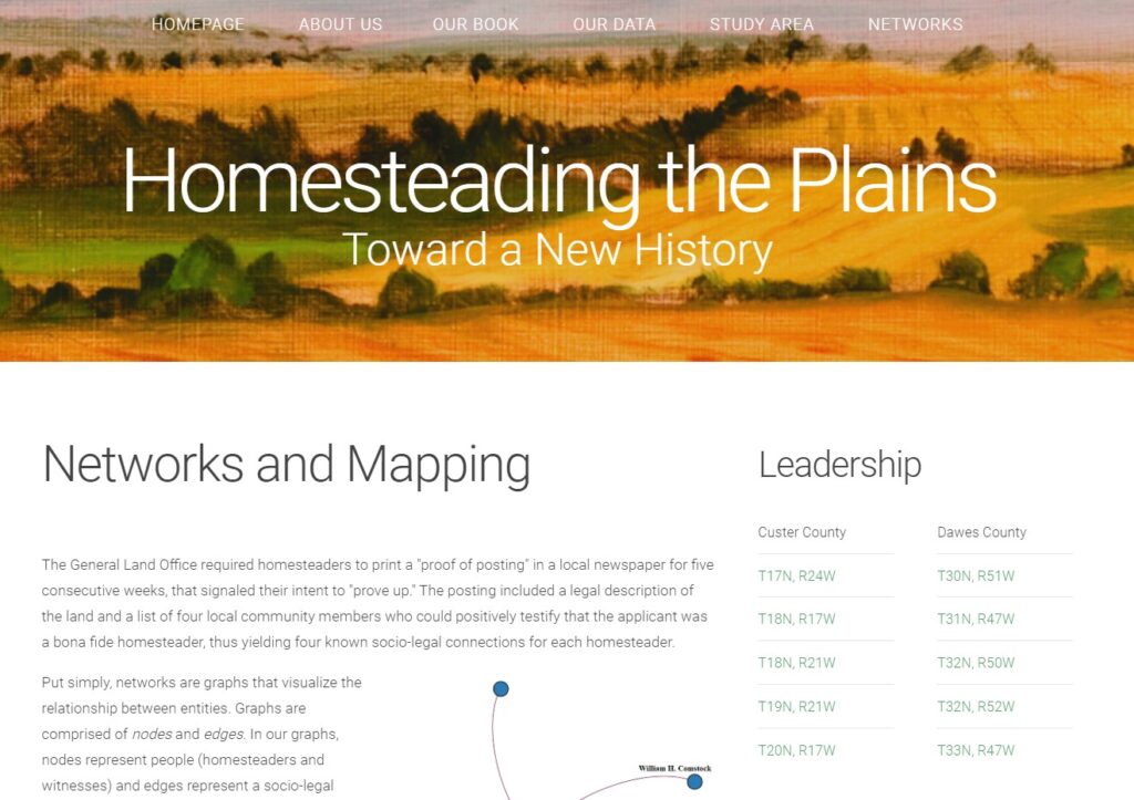
The Homesteading the Plains: Toward a New History project sets out to create a more nuanced understanding of the Homestead Act (and question long-standing scholarly assumptions about the extent of deed fraud) through mapping the ties between homesteaders via the four community members they were required to list in a local newspaper who could “positively testify that the [deed] applicant was a bona fide homesteader” (Edwards, Friefeld & Wingo). This data visualization project was created as a supplement to the trio’s 2018 book of the same name. From the information available on the website, it seems like it greatly enriches the text by making their data available to other researchers, dynamically displaying their results, and delving into the methodology supporting their arguments about homesteading the late 19th and early 20th centuries. However, I’m not convinced that the website and data visualizations have enough context to be useful without reference to the book.
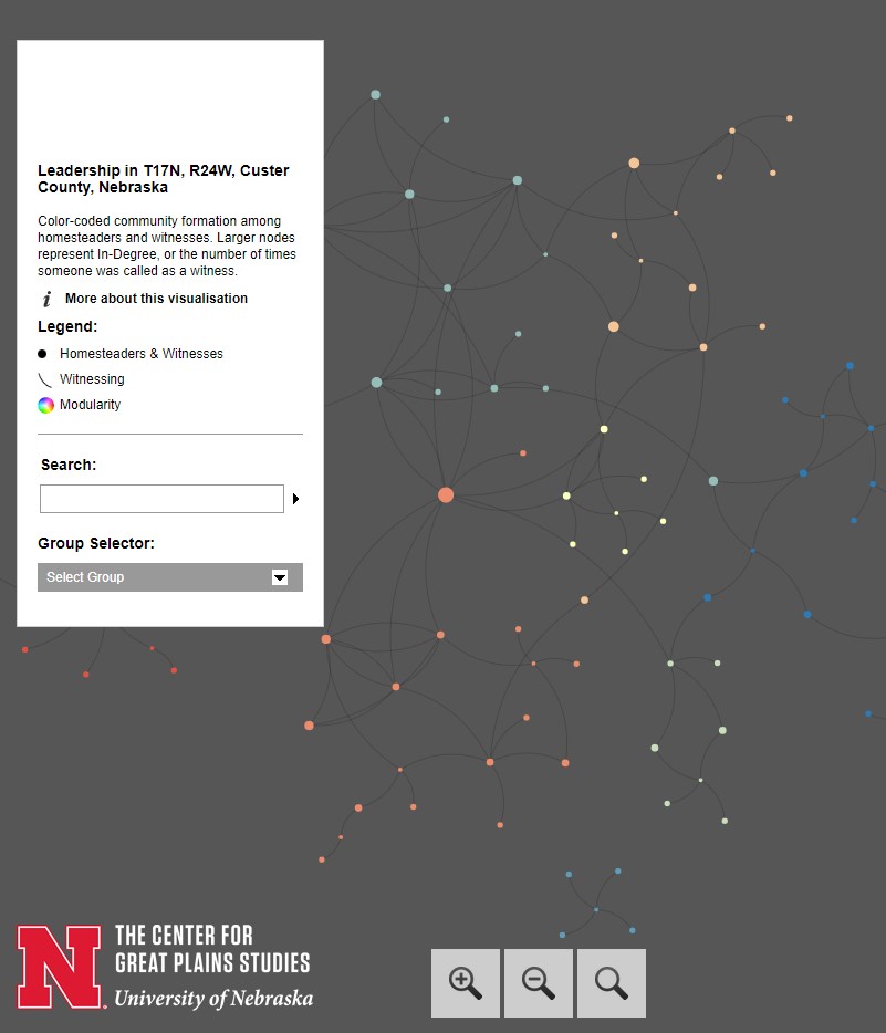
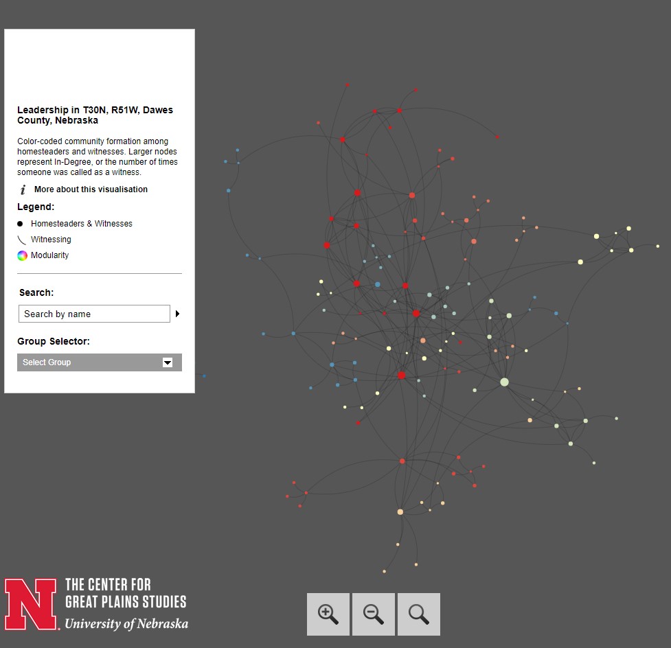
Edwards, Friefeld, and Wingo use individuals as nodes and edges as the hazier notion of “a socio-legal relationship built off of the practice of witnessing.” They are careful to emphasize that since they are relying exclusively on mandatory legal announcements in local papers, it can be difficult to gage the relationships represented by agreeing to serve as a witness. Were witnesses each others friends, neighbors, distant acquaintances? Hard to say. However, the authors argue that the repeated appearances of certain “keystone individuals” or clusters of individuals as witnesses for each others’ deeds allows them to get a sense of individuals’ or small groups’ centrality to different social circles in rural Nebraska.
The website’s network visualizations are relatively interactive; you can recenter the visualizations around different nodes by clicking from one node to another. Personally, I found that certain elements of the project’s visual design made it harder to use. The background color (dark grey) makes it difficult to see the network edges (which are displayed using a slightly darker shade of grey than the background). Although the nodes are color-coded to indicate different communities within a given country, these communities aren’t labelled. So, while I can make an educated guess as to which color node represented a central European immigrant community in a given county, based on surnames and the authors’ assertion that “central Europeans often exclusively witnessed for one another rather than integrating with the local non-immigrant community,” I can’t know for sure.
The website includes intriguing references to other elements of their project that are more fully explored in the book, like merging their network analysis with GIS data to examine community formation. For instance, while the authors reference analyzing whether there was a correlation between claimants’ age, gender and citizenship status and the outcome of their homestead claim, but this data sadly isn’t incorporated into the visualization. As it currently is, this project is intriguing, but would need to incorporate more information from the book Homesteading the Plains for it to truly stand on its own.