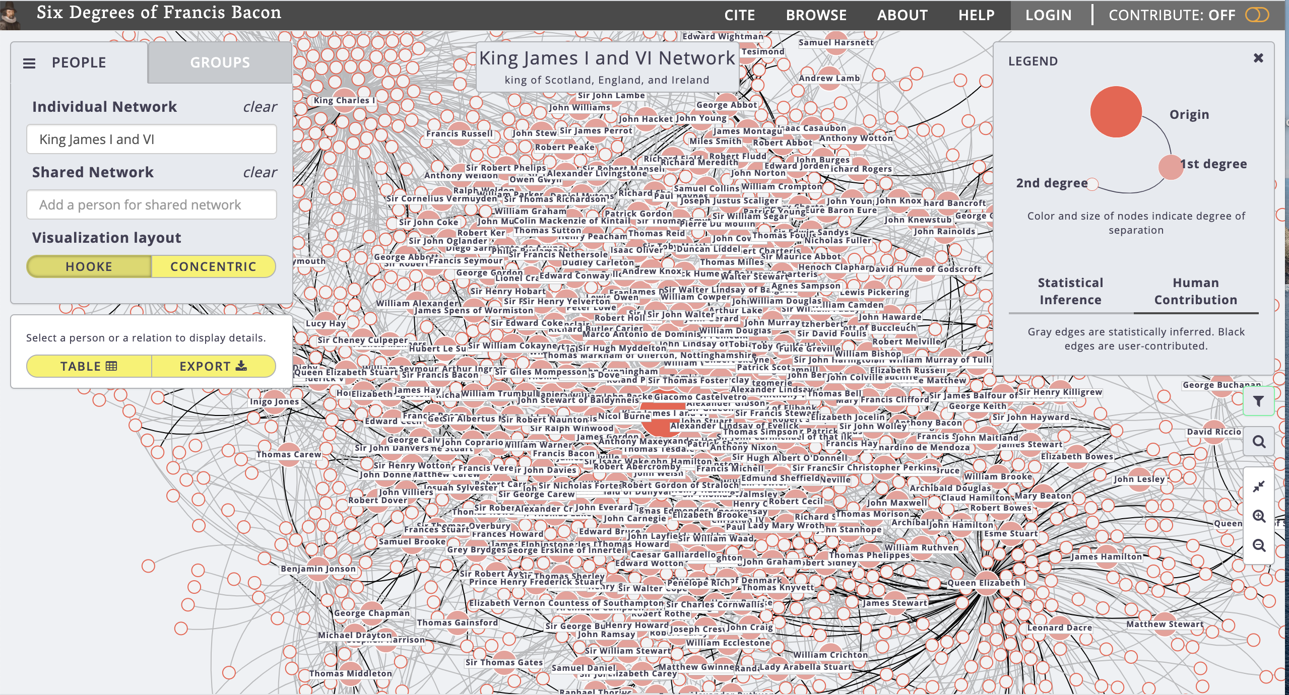
In Six Degrees of Francis Bacon, scholars have reconstructed an early modern British social network to visualize which influential figures knew one another and socialized in the same circles. The digital humanities project uses network analysis to represent these individuals as “nodes” and the social connections between them as “edges”, creating a highly-detailed visualization that consists of more than 200,000 relationships between 13,000 people.
To create the project, scholars at Carnegie Mellon University data mined 62 million words of the Oxford Dictionary of National Biography to identify links between individuals. This statistical method was combined with crowdsourcing to create a large-scale and accurate data model. The project encourages experts to contribute their knowledge and allows scholars to create an account and add/edit relationships, making Six Degrees of Francis Bacon a highly collaborative and open-ended resource.
The graph is highly interactive and can be customized to fit the needs of the viewer. Researchers can search for individuals, move between social groups, and change the visualization of the network (e.g. moving between concentric versus hooke versus timeline views). The project uses color, size, and thickness to represent variations in data: the color and size of a node represents the degree of separation between individuals, while the thickness of edges between groups indicates the number of shared members.
This project serves as another example of how humanities scholars can use digital methods and data science to advance research. By looking at Six Degrees of Francis Bacon, early modern historians can contextualize the lives and works of their subjects in relation to a broader social network.

Good job summarizing this! I was clicking through the various options for this blog post. I was intrigued when I saw this, but it was quite complicated and I decided to hunt down an easier option. I loved the interactive map that this project had, though. It is super interactive, as you noted, and the different connections and interactions really fascinated me.