I explored Inventing Abstraction by MOMA, which is a project about displaying the connections between the pioneering artists of abstract art. The nodes of the diagram are the artists, and the edges are the documented relationships between them, represented by red lines. The relationships, however, do not seem to be categorized. I think that this is one aspect that the diagram could improve on. With the way it is now, you cannot tell what type of relationship it was, just that there was a type of documented connection between the two artists.
The project’s goal is to show that the pioneering artists were more closely interconnected than often thought to be. The way that the project is displayed–a zoomed-out view of all of the connections and artists–is very effective in proving their point. The red lines overlap and intersect so much that it is nearly impossible to decipher where some of the lines begin and end. It is clear that this community of artists were well connected.
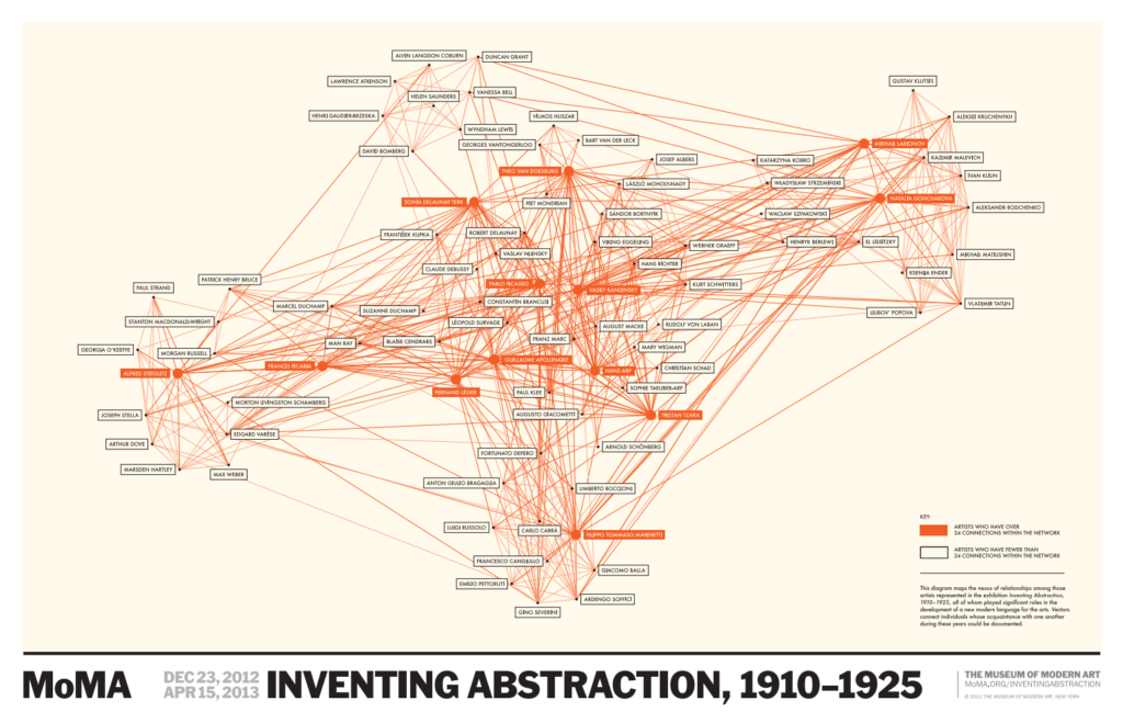
At first, the crowded diagram seemed a bit overwhelming to me. Although the diagram is effective in showing interconnectivity, I was not sure how else I could engage with it in order to extract more information. So, I started to randomly scroll and click around the screen.
That is when I discovered what I think is the coolest part of this project. When you click on a node (which, in this case, is a name), it takes you to a split-screen where the left side of the page shows all of the connections that individual had, and the right side includes a short biography and images of the artist’s works.
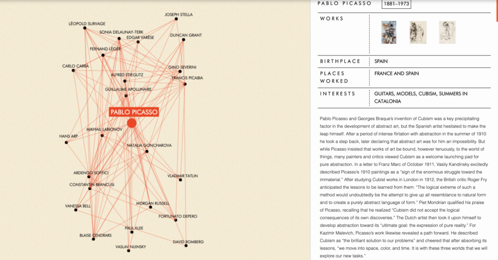
Therefore, you are able to not only see all of the individual’s relationships at once, but you can also learn about their work in significant detail. I really appreciated this interactive element because the nodes were no longer just data points of names that I did not recognize. I could learn about each individual both as an artist, through images of their work, as well as who they were as a person, their hobbies and interests, and what personal relationships they had.
Hi Alyssa,
I also studied this project for my own post and I found a lot of what you said to be the case for me too. I was also overwhelmed by the vast amount of connections at the initial glance, but once I found that I could click on a name it was greatly simplified. I think that the split-screen part of the project that you mentioned is absolutely vital to the project and helps to get an understanding of the person.
Alyssa, this is a really great analysis! This seems really similar to the project that I looked at, Six Degrees of Francis Bacon. Like you, I found it hard to navigate and the relationships between people did not seem to be categorized. I think it would be a great idea for them to incorporate more detail biographies, like the MoMA did, although that might be difficult as the scale of the project gets bigger.