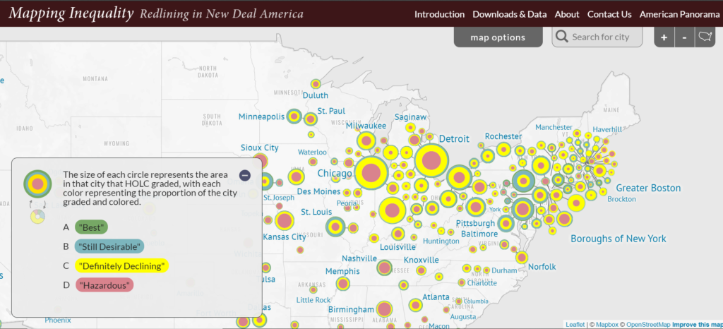
Looking at the title of the project, I wondered: how could you map inequality? Well, four universities and their 3 research teams showed me how. Using the main source, the Home Owners’ Loan Corporation’s (hereinafter HOLC) maps, racial discrimination was digitized to show how it impacted the housing market during the New Deal America.
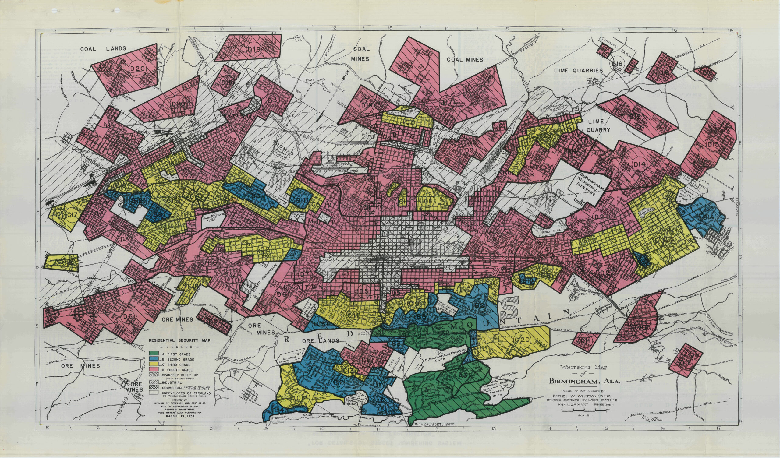
What were the HOLC’s maps? These maps consisted of color-coded blocks (corresponding to neighborhoods) that represented the “quality” of a particular neighborhood, giving a grade between the highest grade of “A” (colored green) the lowest grade “D” (colored red). As you can guess, neighborhoods that were “infiltrated” by people of color had lower grades compared to majority-white neighborhoods.
This blatant discrimination (which can also be read as ‘redlining’) perpetuated the wealth gap between people of color and their white counterparts. Banks were less likely to offer a mortgage loan to people who lived in red neighborhoods (it was near impossible, really).
“…these agencies worked with public and private sector partners to create millions of jobs and help millions of Americans buy or keep their homes. At the very same time, federal housing programs helped codify and expand practices of racial and class segregation.”
The scholars behind Mapping Inequality wanted to bring “one of the country’s most important archives to the public.” Through these maps digitized by geographic information systems (GIS), quantitative statistical methods, mapping, visualization, and statistical tools, people can learn how great this “redlining” affected the lives of American people of color today.
This digital project can be used in different types of academics fields, like history, economics, and social justice.
Constance, this is a fascinating source. I appreciate how it visually maps each neighborhood’s “quality” to show inequality while also giving background on each neighborhood. I was able to look up my community and was interested in seeing the results compared to other communities. I can see this being a handy tool for community activists in my neighborhood.