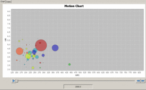
I am very interested in animation so I took a look at Google’s Motion Charts and how it is transforming data visualization in the Digital Humanities. I think that sequential visualization offers researchers the ability to observe trends over time, while interactive visualization allows people to explore data from different perspectives and entry points. One possible drawback for visualizing data in 4D is constraints with hardware specifications. According to Google Chart’s official site, Motion Charts is used to “explore multiple indicators over time.” The platform might not work very well if the goal is to isolate one variable.
Lin’s lecture was very helpful in outlining the overall thought process when processing data in the Digital Humanities as well as drawing attention to some common pitfalls that people experience. Some things I should avoid are starting my axes at 0 and using pie charts since the brain is terrible at comparing areas. On the other hand, good data visualization practices include labeling axes, adjusting bucket sizes, and using different shades of the same color to highlight certain elements.
I also think these types of visualizations are very useful in a variety of fields, even those not pertaining to digital humanities. Motion charts help turn data into a organized and detailed visual that can accomplish a variety of task.