This week we are going to explore the basic principles, and some concrete examples, of data visualization. You might think that data viz is something only scientists and quantitative social scientists are allowed to do, but there are an increasing number of excellent resources for visualizing and analyzing qualitative data.
Today, we have a guest lecture by Lin Winton, director of Carleton’s new Quantitative Resource Center who teaches an entire course about data viz and will show us the ropes.
ASSIGNMENT: Data Vizualization Dos and Don’ts
Following Lin’s discussion, read through the materials below and write a blog post for next class that:
- Answers at least one of the “assignment questions” from the exercises below
- Reflects on the information from Lin’s lecture and how it relates to DH.
- What are some things you to keep in mind or to avoid as you consider data viz best practices for DH projects?
The Minard Map
It may well be the best statistical graphic ever drawn.
—Edward Tufte, The Visual Display of Quantitative Information (1983)
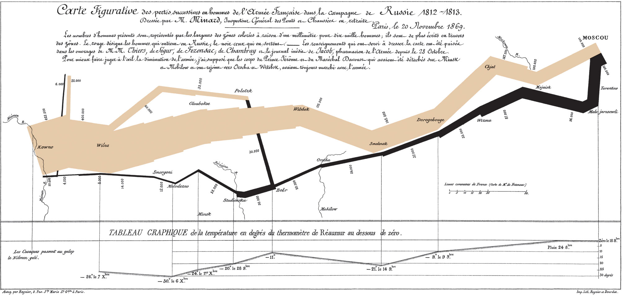
The Classic Discussed
This chart is famous for being a sterling example of data viz done right. In stark colors, simple lines, and minimal accompanying text, it not only tells a story, but offers an historical argument as well. Read the blog post below to be guided through the elements of the chart in an English translation.
- Michael Sandberg’s analysis on his DataViz History blog
- This is part 5 of a 10+ part deep dive series into Minard’s map. If you want more, see all the entries tagged Minard on his blog.
Does Minard’s map live up to the hype?
Do you agree with the glowing praise?
Improving(?) Minard’s Map
Even though it is often praised as the epitome of information design, many people have attempted to improve on Minard’s map. Explore one of the static or interactive variants below.
Is your version better/more informative than the original?
Static variants (Do they add anything?)
- Menno-Jan Kraak’s variant from his 2013 book Mapping Time (Figure 3)
- An annotated version by Michael Sandberg
Interactive variants (Does it help to be able to manipulate the map?)
- A custom coded instance at http://www.masswerk.at/minard/
- An instance using the Neatline plugin for Omeka
- And the developer’s discussion of his process on the Scholar’s Lab blog
Assignment Questions
- Why is this considered such a landmark visualization, if not the best ever?
- What are the key features that make it stand out?
- How would you improve on it, if you were to take a stab?
Keeping it Honest: How Not to Lie with Pictures
This may well be the worst graphic ever to find its way into print.
—Edward Tufte, The Visual Display of Quantitative Information (1983)
We’ve already discussed how not to lie with maps, but it’s easy to do with visualizations as well. One of the biggest issues that Tufte stresses in his seminal work is how to stay honest with infographics. One of the easiest errors to make, for instance, is to scale the radius of circles, or one axis of two dimensional shapes, which results in massively larger areas than your data actually warrants.
- Explore
- this gallery of images illustrating “The Lie Factor”
- Think about how the literal measurements of the images contradict the implicit argument the graphic is trying to make.
- You can also explore the r/dataisugly subreddit for some good examples of bad data viz
- this gallery of images illustrating “The Lie Factor”
- Explore some more of Michael Friendly’s gallery of the Best and the Worst of Statistical Graphics
Assignment Questions
- What mistakes did you not think of before that you might want to avoid?
- What examples might you like to emulate for your own projects?
- Why?
Animation (unlocking the 4th dimension)
As we think about data viz for historical topics in particular, it is often the case that animation provides the most intuitive way to visualize change over time. Below are some classic examples of animating data viz in order to tell a story or make an argument.
Isao Hashimoto’s “2053”
What story does this video tell?
What are the data?
Why is the presentation so effective?
Google Motion Charts (Gapminder)
One of the most impressive data visualization breakthroughs of recent years was Hans Rosling’s invention of Gapminder: an application that really unleashed the “fourth dimension” of time and allowed data to be animated in an immediately understandable and powerful way. His TED talk below illustrating global health data with the tool is legendary.
Google bought the technology and made it available for all to use as Motion Charts. You can use the API or create a Motion Chart from data in a Google Sheet.
Assignment Questions
- What new possibilities does interactive and/or sequential visualization unlock for DH projects?
- What, if any, are the drawbacks from visualizing data in “4D”?
Further Resources
We’ve already explored some easy entry visualization environments, but here are some more very impressive tools and languages to check out:
- Data Visualization Catalogue (that Lin Winton likes!)
- Tableau Public (an online visualization studio where you can upload your data and produce impressive, easily shareable data viz)
- D3.js (the current reining king of interactive online visualization)
- R graph gallery (R is a statistical package that generates very nice visualizations with very little code)
Choose one and check it out to see what people are creating.