An important part of any digital humanities project is conveying information about the data you’re using, so for this tutorial, I chose to share how to use RAWGraphs 2.0, an open-source web-based data visualization tool. RAWGraphs, a tool that “aims to provide a missing link between spreadsheet applications […] and vector graphics editors” like Adobe Illustrator (link), is free and easy to use.
I first heard about it on the FlowingData blog, which highlights interesting digital humanities and data visualization projects and “explores how we use analysis and visualization to understand data and ourselves” (link).
Step 1. Loading your data: Although you can use this tool to analyze your own data after either pasting it into a text box, linking to a URL, or uploading it as a TSV, CSV, DSV or JSON file, the website also includes example data sets to play around with.

After selecting the tab “Try our data samples,” you can choose between different example sets. The examples include suggestions as to which types of graphs best suit the different data sets, although these suggestions for the best graph formats aren’t available if you upload your own data.

Select the “Highest grossing movies in history” data set.
Step 2. Double-check that your data loaded correctly and is formatted properly: The website will bring you to a page that allows you easily modify how your data is organized.

For example, you can change the thousands separator to a comma and the decimals separator to a period, which is helpful is you are working with datasets compiled in Europe (ex: 10.000,01 versus 10,000.01). This step allows you to ensure that your data was uploaded cleanly.
Step 3. Choosing your preferred data visualization format: Next, you can chose from 23 different graphs and visualization options.

The left-hand side of the screen displays information about how the type of visualization you have selected displays data. Select the Bubble chart square for our “highest grossing movie” dataset.
Step 4. Organizing your visualization: Next, scroll down to Mapping. You can drag and drop different variables (originally column headers in your data) to serve as different parts of the graph.

For this tutorial, I’d suggest setting Budget (million USD) as the X Axis, Real Worldwide Box Office (million USD) as Y axis, Budget (million USD) as Size of bubbles, movie Genre as bubble color, and film title as Label.
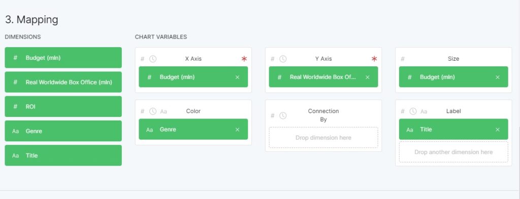
The graph is created automatically below; it populates as you drag and drop different variables to the boxes, and will update if you switch the variables around.

Step 5. Customizing your graph’s appearance: Next, you can further customize different elements of the map, from colors to margins and more.

In this case, it would be useful to include the optional legend, which you can toggle under the “Artboard” subheading.
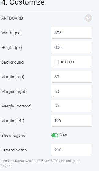
Toggle “Show legend” to Yes. 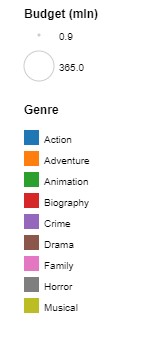
The visualization legend.
Step 6. Downloading your finalized data visualization: Once you’re satisfied with it, you can chose to export your visualization in SVG, PNG, JGP or RAWGRAPHS format!

The website’s creators request that you cite them as follows if you use a graphic created by their site:
Mauri, M., Elli, T., Caviglia, G., Uboldi, G., & Azzi, M. (2017). RAWGraphs: A Visualisation Platform to Create Open Outputs. In Proceedings of the 12th Biannual Conference on Italian SIGCHI Chapter (p. 28:1–28:5). New York, NY, USA: ACM. https://doi.org/10.1145/3125571.3125585
RAWGraphs is an extremely user-friendly data visualization tool, and its versatility and adaptability means that it is suitable for use for a variety of data-driven digital humanities and STEM projects alike.
Sources Referenced:
Mauri, M., Elli, T., Caviglia, G., Uboldi, G., & Azzi, M. (2017). RAWGraphs: A Visualisation Platform to Create Open Outputs. In Proceedings of the 12th Biannual Conference on Italian SIGCHI Chapter (p. 28:1–28:5). New York, NY, USA: ACM. https://doi.org/10.1145/3125571.3125585
RAWGraphs. https://rawgraphs.io/
Yau, Nathan. “RAWGraphs 2.0, an open-source tool to visualize data.” FlowingData. Published Mar 4, 2021. Accessed Mar 4, 2021. https://flowingdata.com/2021/03/04/rawgraphs-2-0-an-open-source-tool-to-visualize-data/