Data visualization is essential for understanding, analyzing, and presenting your data. While there are many data visualization tools available such as Flourish, ggplot2 is one of the most popular tools best known for its flexibility and reproducibility.
ggplot2 is a data visualization package for the statistical programming language, R. Although learning and mastering ggplot2 can be a little difficult since it requires you to be familiar with basic R syntax, I believe it’s worth taking the time to learn it.
ggplot2 is great for DH projects because it’s
- Flexible: you can easily make complex graphs by adding layers.
- Reproducible & Scalable: you can save plots as objects, which means there is no need to repeat the same code. You can even make a new graph by modifying saved graphs.
With ggplot2, you can create almost any static graphs you can think of: boxplots, bar charts, histograms, dendrograms, etc.
In this tutorial, I will give a step-by-step instruction on how to make a simple histogram in ggplot2. I hope this tutorial will serve as a starting point for people interested in DH to explore the power of ggplot2.
Step 1: Install R and R studio
In order to get started with ggpot2, you need to have R and R studio installed on your computer. If you are using lab computers at Carleton, you can skip this step.
You can download R and R Studio by clicking the following links:
Step 2: Install and load ggplot2 package
There are two ways to install ggplot2 on your R.
- Install ggplot2 package
- Install tidyverse package, which includes ggplot2 package
I would strongly recommend the second option because tidyverse contains many other packages that you are likely to use in everyday data analyses,
In order to install tidyverse package, scroll over to the tab Packages on the bottom right of your screen. Then, click a small symbol that says Install and you will see a pop-up window as shown in the screenshot below. Type in “tidyverse” and hit Install.

Once you install tidyverse, you need to load it on your rmd document by typing the following: library(tidyverse). You can run this line by hitting ctrl+ enter. Or if you want to run the whole chunk, you can do so by clicking the green triangle shown in the screenshot below.

Step 3: Import datasets
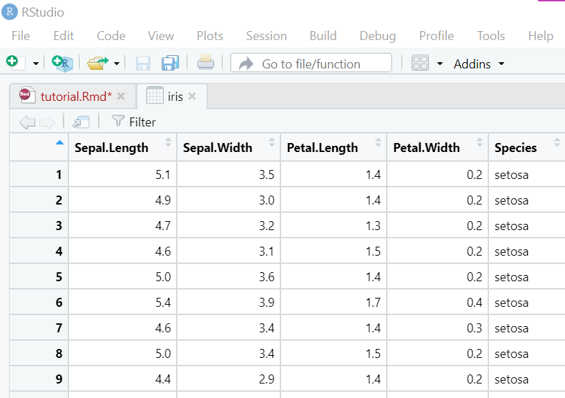
You can’t make graphs without datasets! In R, there are multiple ways to import datasets depending on your dataset types. Click here to learn more about how to import datasets in R! In this tutorial, we will be using one of the built-in datasets in base R called iris.
This famous iris dataset contains four measurements for 150 flowers representing three species of iris (Iris Sentosa, versicolor, and virginica).
You can load the iris dataset by typing the following command: data(iris).

You can view the iris dataset by typing the following: View(iris).
Step 4: Make a histogram
Let’s create a histogram to see the distribution of Sepal.Length.
Create a new chunk and type the following command:

and you’ll get a histogram like this!

This code is a little more complicated than those we already covered in this tutorial, so let me briefly explain what is going on!
In order to initialize a plot, we need to tell ggplot that iris is our dataset. Next, we need to specify that our x axis plots the Sepal.Length variable. Then. we instruct ggplot to render this as a histogram by adding geom_histogram() option. We can change the the number of bins by adding a bins argument to geom_histogram().
Step 5: Change colors & add a title
Let’s make the histogram we created in Step 4 a little fancier!
You can change the color of histogram bins by adding a fill argument to geom_hisogram(). In addition, you can add a title to your plot by adding labs(title=) option.

You’re all done! I hope this tutorial gives you a general idea of what ggplot2 is, how ggplot function works, and how to make a simple histogram! There are so many other ways to customize your plots in ggplot2, and if interested, I’d recommend you to take a look at the following resources:
The code for this tutorial is as follows:
library(tidyverse) #load the tidyverse library
data(iris) #load the iris dataset
View(iris) #let's take a look at iris

#Simple histogram
ggplot(iris,aes(x=Sepal.Length)) +
  geom_histogram(bins=40)

#Change color + add a title
ggplot(iris,aes(x=Sepal.Length)) +
  geom_histogram(bins=40, fill="orange")+
  labs(title="Histogram!")
Hi Erika,
I have also used R and RStudio in my Stats class here at Carleton. I thought that your tutorial was written well and that it was very useful to show how to import a dataset. However, I noticed that you installed the tidyverse package and I am used to installing the ggplot2 package when I do this. I think it will end in the same result I just found it interesting that there is more than one way to do it in R.
I really enjoyed this tutorial! Like Will, I have been using R in my statsitics class and install it using the library(ggplot2) command. I just tried using tidyverse package and it worked well too! Overall, your tutorial was well organized and really easy to follow.
Hi Erika,
I really liked how you explained what is actually happening when you use certain code! In my experience using R I just tend to copy and paste from examples and then hope for the best, so it was really helpful to read about what the code is actually doing. And going off of what Will said above, I also usually just install the ggplot2 package but from your detailed explanation it seems that the tidyverse package is better!
Erika, thank you for this tutorial. I loved how you described how to use the ggplot2 package. I have found the reasoning behind the command geom_histogram to be very difficult, and your tutorial has helped me. I also appreciate how you show people how to change the fill color and title the histogram-these are very important for data visualization. If this is a tutorial for a novice, you may want to add that you used an R markdown document, how you made it and how to establish a chunk of code, as the lack of these steps may confuse the reader. Overall, very well done!
Excellent tutorial, Erika! I’m taking stats 120 right now, so it was a good refresher for the final project 🙂 Normally in class I would just use R without thinking much about it, but in this tutorial I really understood what was happening and why ggplot2 is a good choice. I appreciate how you split the tutorial into clear steps and bolded some of the most important points. The ggplot2 cheat sheet is a great resource.
Great tutorial Erika! I was able to get it all working after I loaded tidyverse (which took a while)! Really clear instructions and nice simple example. I love how you included the code snippet at the end, but it might help to include that earlier instead of the images, since I got one error where I misread the code and put a minus where there should have been an equals! The other step you might include for newbies is what an rmd document is and how to create a new one if you don’t know.
I took intro stats two years ago now, so while most of this should have been a review for me, I had forgotten most of it. This is well composed, thanks for the tutorial!