Data visualisation has always been a topic of great interest to me, primarily because it enables individuals to see analytics presented visually so that they can grasp concepts which might otherwise be difficult to comprehend. Having a difficult concept drawn out for me on a piece of paper or using a chart to model an abstract concept tends to make them easier for me to understand and I’m sure other students feel similarly. That is the chief idea behind data visualisation as I came to understand it from Lin’s lecture. I worked on a research project revolving around infographics with Eric Alexander of the CS department over winter break and a lot of the things we touched on were similar to the subjects covered by Lin’s lecture yesterday. Data visualisation is a great and handy tool but because it has become so easy to depict data in an aesthetic way, people tend to misuse this resource. There are multiple examples of visualisations and infographics gone wrong and a simple Google search can reveal pages and pages of such examples. We can very easily get carried away with the process and combine colours that just don’t go well together or use a really fancy font to explain a graph that is unnecessary, thereby producing a hideous and rather unpleasant chart. In order to avoid this, we need to delve further into how the eye and the brain process information and often infographers will utilise this scientific information to their advantage to create the ‘perfect’ model to get their point or information across to readers. Use a bold red color to bring the reader’s attention to a specific part of the graphic, or use similar colours to group words of the same semantic group together, etc.
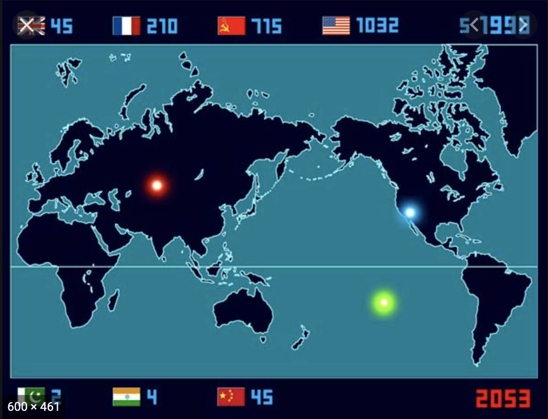
For the purposes of this assignment, I looked at “2053” by the Japanese artist, Isao Hashimoto. 2053 is the total number of nuclear explosions conducted in various parts of the world between 1945 and 1998. The first nuclear test was conducted in July 1945 in the desert of New Mexico, USA. Soon after that, the atomic bombs were consecutively dropped on Hiroshima and Nagasaki, and ever since then the tests have been repeated a total of 2053 times until the year 1998. This piece is really special because it is a bird’s eye view of global history by scaling down a month’s length of time into one second. Over the course of fourteen and a half minutes, every single one of the 2053 nuclear tests and explosions that took place between 1945 and 1998 is plotted on the map. A metronomic beep every second represents months passing, and a different tone indicates explosions from different countries. The video doesn’t use any letters to present its message, only numbers and pictorial representations of flags, so this gets rid of any potential language barrier that might exist when people from all across the globe want to view the video which goes back to the idea of accessibility that was talked about in the lecture.
This time-lapse is really powerful. Isao began the piece in 2003, with the aim of showing, in his own words, “the fear and folly of nuclear weapons”. Hashimoto said:
“I created this work for the means of an interface to the people who are yet to know of the extremely grave, but present problem of the world.”
Isao Hashimoto’s website
It tells an important tale about the nuclear state of the world and is a great example of a good visualisation.
Maanya, I looked at “2053” as well and thought your point about its ability to communicate a message to everyone, regardless of language, was really poignant. One of the things that I found so powerful about the video was the data’s ability to speak for itself.