(Defunct) Google Motion Charts
My first thought (aside from being amazed) when seeing Gapminder in action was that this application allows for data to be visualized so much more efficiently and concisely! By utilizing the “fourth dimension” of time through animation, all the data could be easily understood without jumbling everything together or omitting factors. Without this animation, it would be difficult to include all the data for all the different years and countries. But through animation, all the data could be displayed in one contained and continuous form. Along with making the data visualization so much cleaner, such interactive and sequential visualizations make it so much easier for the viewer to understand the information. Seeing the data actually move up and down as the years change helps hammer in the connection between the time and the data.
I couldn’t really come up with any drawbacks from visualizing data in “4D,” so when I tried to make my own Motion Chart I was really surprised to find that it was no longer available in Google Sheets. I looked around and found out that Motion Charts were removed in 2017 due to being “one of the lesser-used chart types.” This surprised me even more! Motion Charts seemed like such a useful way for data visualization, yet why were people not too keen on utilizing them? Perhaps most people aren’t working with data sets that need the “fourth dimension.” Maybe they aren’t working with large ranges that span multiple decades. I also took a look at the guide to incorporating a Motion Chart and it stated that data usually have to be changed to the correct format for Motion Charts, so perhaps this extra step was too much of a hassle for people. Another potential reason that people wouldn’t want to use Motion Charts is that the animation might become distracting. But honestly, I feel that the user could just watch the chart animation several times thus calming down from the initial excitement and then getting information. And it would still be less time consuming than trying to make sense of a cluttered static graph.
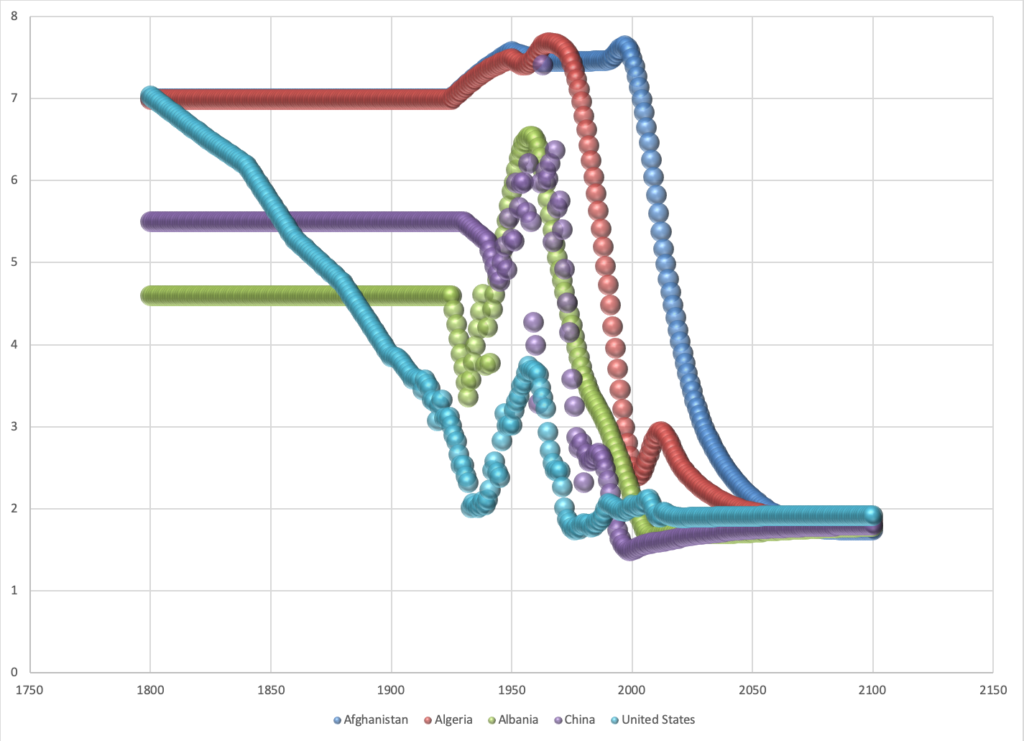
The Google Workspace Update I linked above that detailed why Motion Charts were removed also suggested at the end to try Bubble Charts as an alternative. So I chose a data source from the Motion Charts guide and made a Bubble Chart of the number of children per woman in different countries from 1800 to 2100. It was much too messy with all the countries, so I only included five. This process only made me wish that Motion Charts were still available because I can definitely envision a Motion Chart handling all the data that this Bubble Chart couldn’t.
Lin’s Lecture
The biggest takeaway for me from Lin’s lecture was that “Pie charts are horrible!” Aside from serving as a reminder that I should probably never use a pie chart to display my data in the future, it also made me ponder how DH projects must juggle the delicate balance between being user-friendly/appealing and being informative/accurate. I can definitely see the temptation in using pie charts; they package up the data in a smooth, neat, and colorful little circle that’s easy on the eyes. To a less informed user, a pie chart would be much easier to read and gain information from than a graph with various intersecting lines. But that’s also the main danger of pie charts because that same user probably won’t realize how misleading the pie chart is. So, DH projects really need to make sure that they are visualizing data accurately while also displaying the data in a way that a person with little background in the field can easily access the information because that way more people from all levels of learning can learn.