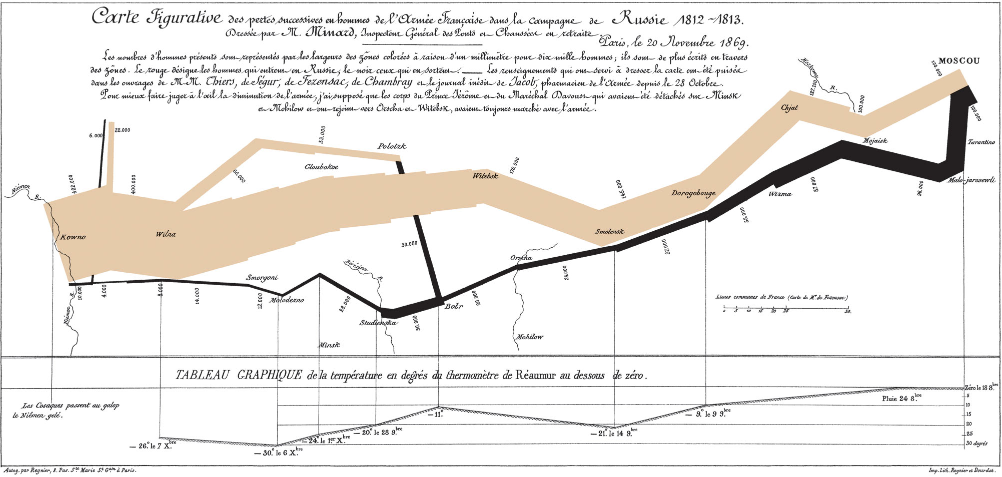

This map, created by Charles Minard to represent Napolean’s Russian Campaign of 1812, is a great example how thinking outside of the standard, prescribed-chart box can relate lots of complex data in a simple visual. Perhaps the most striking feature, as noted in Michael Sandberg’s Data Visualization Blog, is the use of line-thickness to represent the remaining size of Napoleon’s force. With just that information alone, a viewer can immediately see how his force dwindled from a massive army to nothing more than a thin, defeated line.
What makes this map so impressive is not any one thing by itself, however; it is the levels that are available to the viewer. The first time I looked at this map, I did not know what anything represented. Then I learned that the lines’ thickness represents the size of the force, making me appreciate how devastating a campaign this truly was. Then I realized that the shape of the army’s movement represented the path they took, with geographic markers along the way, allowing me to see which locations were most costly to the force. The longer I looked, the more information I found and the more in-depth the message became. Importantly, however, I did not need to know all of these pieces to gain a lot from the map; the line thickness alone created a memorable picture.
Such an intricate and visually-pleasing map probably cannot be improved on much, but if I were to try, I would try to create an interactive map that allowed the user to zoom in on particular locations to find local statistics and read manuscripts, letters, and other informative documents in those areas. This way, the user can feel like they are travelling along with the army, rather than viewing their entire journey from above. Something like David McClure’s interactive version of Minard’s map, but with a little bit more detail and viewing options/angles would help me to see even more specific information than a static map can represent.

Minard’s map illustrates the importance of considering how best to visually represent your data, which is the main piece of advice that I took away from Lin’s lecture. It is very tempting for me to get excited about my data, especially when there’s a lot of it, and forget that others do not have the same contextual information about it that I might. It’s also easy for me to get carried away in the bright colors, thick lines, and other bold features while forgetting to limit them to only what’s necessary and helpful. In the context of DH, and in any data-driven field as well, it is crucial to remember that data is meaningless unless you can tell a story with it, and to tell a story, you need to consider your audience; giving Minard’s map to a military strategist will not have the same affect as giving it to an historian. As I go forwards in DH, I will remember that, whether it is a graph, map, or project in general, it is crucial to spend just as much time considering how to represent your data as it is to consider what to represent in the first place.
Henrie, I also learned a lot about how to best represent data. Many of the things that appear to be coincidental to the untrained eye are purposeful, such as the color or width of lines, among other things. Charles Minard’s map does a fantastic job at representing the campaign, including many different pieces of information from different sources (such as the outside temperature and size of the army). I wonder what other uses a model like this would have in other fields besides military history.
Hi Henrie! I like how you analyzed Minard’s map from multiple perspectives such as geographic location and force size. I agree with you that it can be improved in the digital age with interactive elements